

Cutting Edge Website Designs Today
The internet is multifaceted and is full of amazing and inspirational websites. Just with a little bit of research one can easily enter a creative world of cutting edge website designs which are pushing all the possible design and technological boundaries to create an unforgettable experience.
Here, we have shortlisted some ever evolving website design trends to watch out for in 2019. However, it needs to be kept in mind that these are not mere templates that can be copied, instead can be analyzed and used as a guideline for improvising your own creativity and attract website traffic more than ever.
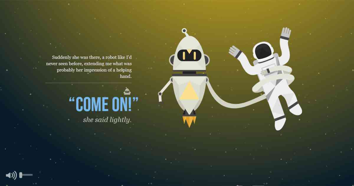
1. Animated Backdrops
By ÔÇśAnimationÔÇÖ we mean a rapid display of images in a sequence which gives us an illusion of a motion picture. This technique has always been in the existence, time before web began. In the recent times
website designing
has seen much limelight and with the technological advancement in the browsers, websites are now gradually shifting away from the usage of static images to a more engaging interface, which is animation.
It is one of the best tools that can be used for extensive user engagement and initiates an interactive story telling session. Small animated designs give an extra edge of fun and abstract visuals which create meaningful interactions for visitors and increase their dwell time.
LetÔÇÖs take a closer look at some of the advantages animated website designs give over others:
- Improves overall experience
- Attracts more attention
- Acts as a guide
- Increased dwell time
- Increased interaction
- Creates an emotional connect
The most common web animation formats used today are SVG, GIF, CSS, Video and WebGL. The animation on your website can be as simple as an underline appearing on mouse movements or a full-screen video as an animated background. All that an
animated website design
requires is to be subtle yet engaging.
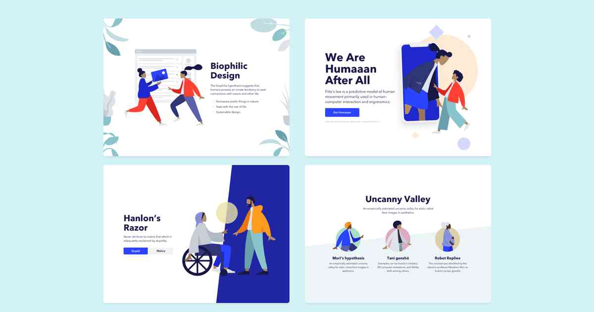
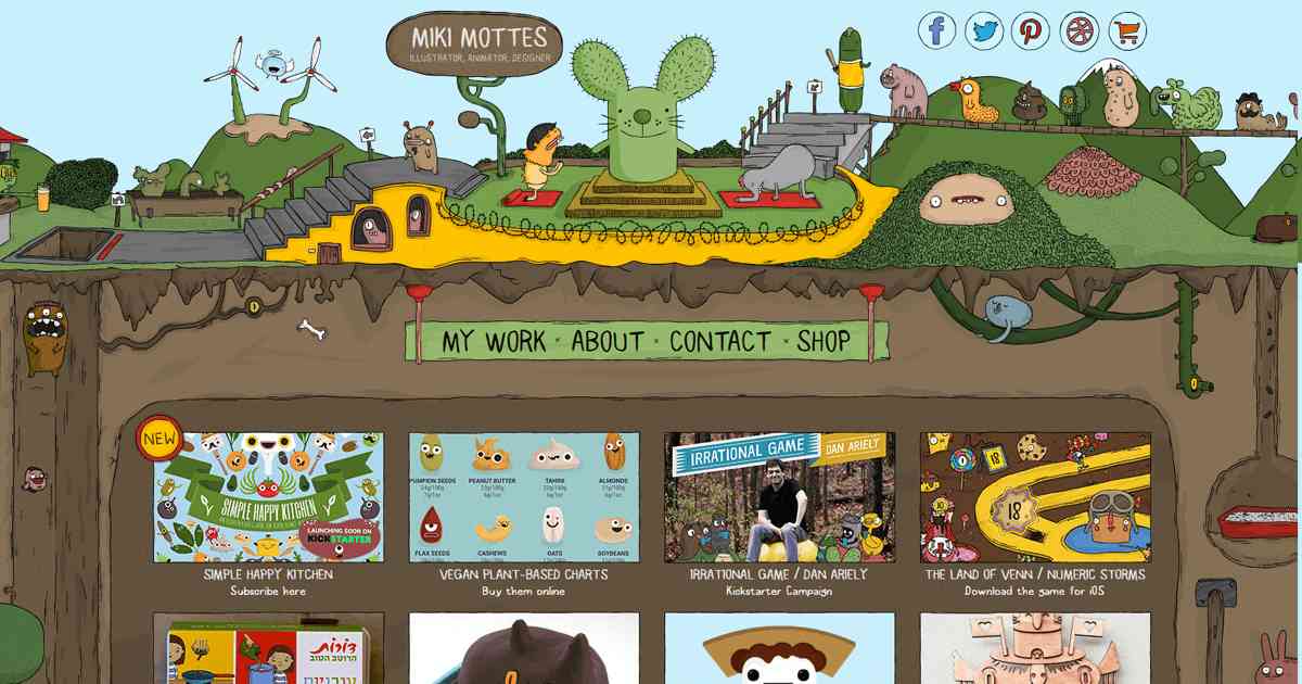
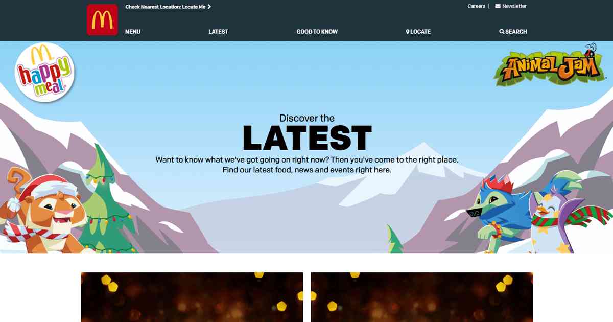
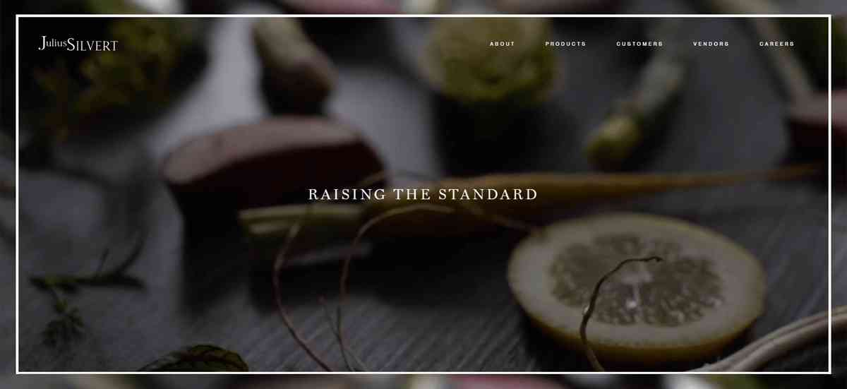
2. Designs with Illustrative Interaction
The illustrative interaction designs of website are not as easy as they seem to be but they surely are an overwhelming website design trend. All you need is a little creativity, color and compelling illustrations which would change the websiteÔÇÖs image and increase the overall impact on your visitors.
To obtain a bespoke illustrative design for your website you need a highly experienced sketch artist who can create illustrations which are friendly, versatile, playful and adds an element of fun ÔÇô all that a brand website requires to strive in the competition and engage more visitors.
Illustrations designed by in-house designers provide a more personalized touch and gives the inner story of the brand with a unique point of visual difference. Refrain from using stock illustrations and stock photos because that will eventually reduce your distinctiveness and effectiveness of your website. Also, outsourcing an illustration could be a little expensive but on the contrary could produce extremely good results that would eventually increase your web traffic.
With your own illustration style you can elevate your page and draw attention towards your website. This is the perfect design trend for brands which are energetic and fun-filled such as sports brands, digital agencies, online education etc. No matter what your product or service may be, there is always an illustration style that matches your website perfectly.
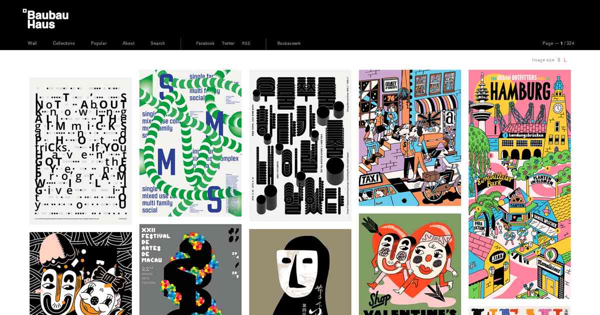
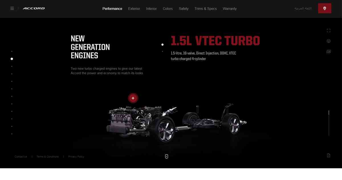
3. Grid Structure / Modular UX designs
Let us understand the basic concept of grid structure or modular UX design website: With the passage of time weÔÇÖve been seeing web pages, whose designs are broken down into smaller modules and organized in grids which present well-structured information thereby allowing the users to quickly navigate through and scroll for whatever they need.
Modular design is about breaking down a design into small parts (modules), creating them independently, and then later combining them into a larger system. This design style organizes the content modules clearly across the site to maximize the information flow apart from allowing the designer to easily reformat the layout according to different layout and screen. Thus delivering a better user interface and an optimized coherent experience, irrespective of the device you are browsing. Additionally the designed structure can be used and reused over a longer period of time which will thereby maximize productivity.
These modular UX designs works great on scrolling mechanics by building up a dynamic layer of moving content and giving a sense of depth. It also helps in drawing attention to any particular section of the page and guides the visitor through.
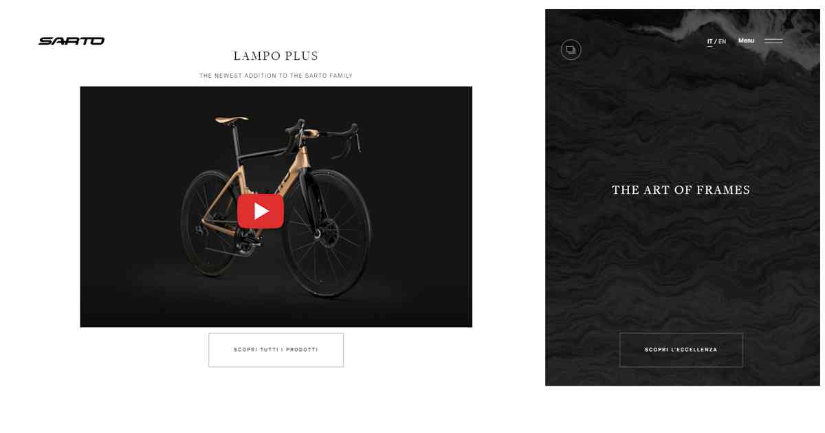
4. The Video Element
Videos on your website not only diversifies the page but also caters the audience who prefer
interactive content
more than lengthy textual information. The video element increases the ability of your website to attract and engage the visitor. Below are some advantages of embedded video within the web page design.
Quick delivery of message ÔÇô A custom video is one of the best and fastest ways to convey your message across your visitors. Videos are a great complement to your copy and strengthen the overall message.
Stand out ÔÇô Custom videos are a great way to make you stand apart. Posting about some ongoing activities about your organization or some do it yourself (DIY) videos which makes your brand unique and keeps you ahead of the competition.
Increase dwell time ÔÇô It makes your customers spend more time on your website because they truly connect with what you are ÔÇô Showing. This explains the major difference between active and passive engagement.
Is more entertaining ÔÇô There is no set rule of your video being ÔÇśonly informativeÔÇÖ, it can be fun and entertaining too. There are very much chances of even your video going viral, which will definitely increases your traffic. Just do not forget the ÔÇśCopyright ActÔÇÖ.
Drive more traffic ÔÇô Not only Google but Yahoo, Bing and other search engines too love fresh content. With the help of various video hosting platforms such as YouTube, one can host a number of videos. Creating a channel on YouTube for all your uploaded videos and embedding them on your website would result in increased web traffic.
Maximizes your reach ÔÇô By sharing the
video of your website
on different social media channels, creates higher chances of your video being shared and to be seen, in-turn maximizing your reach.
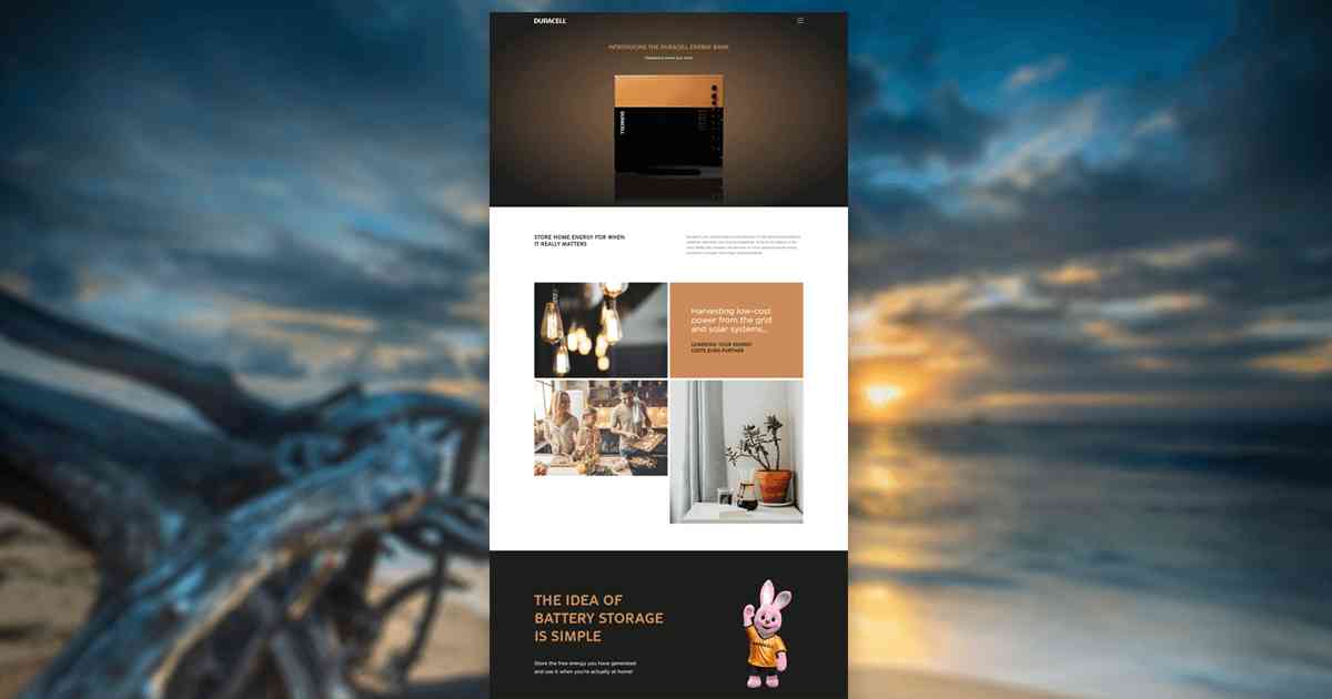
5. Parallax Design or Single Page Scroll
The one evergreen website design trend that simply refuses to fade away is –
Parallax Scrolling
Websites also known as
Single Page Scroll Websites.
In this website layout technique the background image of the page moves slowly as compared to the one in foreground, thereby giving a 3D effect while scrolling. Parallax website design or single page scroll design gives the subtle element of depth to the website while increasing the engagement and recall value.
A number of businesses have taken up this design ethic and have experienced a substantial gain in the number of their website visitors. LetÔÇÖs take a look at few of the reasons:
Uniqueness
In the world of web designing, parallax scrolling is not the norm, hence it gives a unique edge. The biggest advantage being, the designer gets ample room to explore creativity, as they need to focus on only one page.
Images and lots of images
The visual attraction is the catch.The ability to add a lot of images, doubles up as one of the biggest advantages of this design. The layout of the page being image driven keeps the visitor engaged for a comparatively larger amount of time.
Less text. Great importance.
Single page scroll, lots of great images and bare minimum text to support ÔÇô and you get the perfect website. The text only needs to share the exact information minus the age old long contextual story, which acts as a catalyst while engaging the customer.
Optimized for use in mobile
Single page websites are meant to offer easy navigation ÔÇô Scrolling down. This acts as a boon for the visitor as they just have to scroll down on their smaller mobile screen. According to a recent survey 52.2% of all website traffic is through mobile.
6. Responsive Design
This is the next gen trend which has the tendency to adapt. With the rapid development in the IT industry, the no. of devices used for accessing the web has increased. The usage of desktops, laptops, mobile phones, tablets, kindles, smart televisions and other smart devices with varied screen dimensions demand a website that adapts.
Hence, there is a very strong need of websites that resizes its content and layout according to the resolution available. While implementing this website design technique, it is advisable to pay attention to some points mentioned below:
- The menu and the content needs to be displayed according to the need
- Images and videos should be resized dynamically
- Bigger menus, links and buttons on touch screen devices for better visibility and easy navigation
- More space between interactive links to avoid accidental press
- For easy reading font size and line spacing to be used accordingly
Responsive Web Design (RWD) is a client-server technology which is mainly realized through cascading style sheets (CSS). The motive of RWD is to adapt the content layout with minimum server requests. This works best when the content is rendered according to the device being used.
LetÔÇÖs go through some major advantages of responsive design:
- Cost effectiveness, as the designer saves time and money by not maintaining a separate mobile version of the website.
- Broadcasts content on multi-devices at one-time by automatic resizing the page elements.
- The content can be degraded if required. For instance there may be objects which are not required for smaller screen sizes, those can be eliminated and vice versa.
- No zooming required due to easy readability.
- Easy navigation, with least panning and scrolling.
Conclusion:
Somewhere between parallax scroll, animation and modular website designs, 2019 is all set to welcome new creative ideas and revolutionize the already existing ones to a whole new level in the field of Website Designing.
Remember, no matter which design you choose to implement for your website, nature of your business must always be the top priority. One must note that a particular type of website design may be fruitful for a specific industry, but will definitely not cater to each and every business present out there. However, we too are eager to see that what are the designers going to come up with and how theyÔÇÖll be pushing the limits.

Top 4 Ways to Fix HTTPS ÔÇťNot SecureÔÇŁ Warning in Chrome

7-Point Checklist to Build an Ideal Business Website
About Author
David Miller
Digital marketing consultant with 15+ years' experience. Primarily focused on consulting companies on their digital presence while helping them grow technology for attribution and advertising. Worked with brands and created product roadmaps, created and managed multivariate testing, performed site optimization to increase organic traffic, improved conversion rate on e-commerce sites, and created monetization plans for the largest business websites in the US.